If you’re designing in 2025 and still reaching for the same overused fonts, it’s time to evolve. Typography trends have moved on—and thankfully, some of the freshest, most high-impact fonts this year are completely free for commercial use.
These aren’t your average freebies. These are the Best Free Fonts of 2025 that look and feel premium, but cost absolutely nothing. Whether you’re building a brand, designing merch, or setting up editorial spreads, these fonts are designed to lead. Let’s dive in.
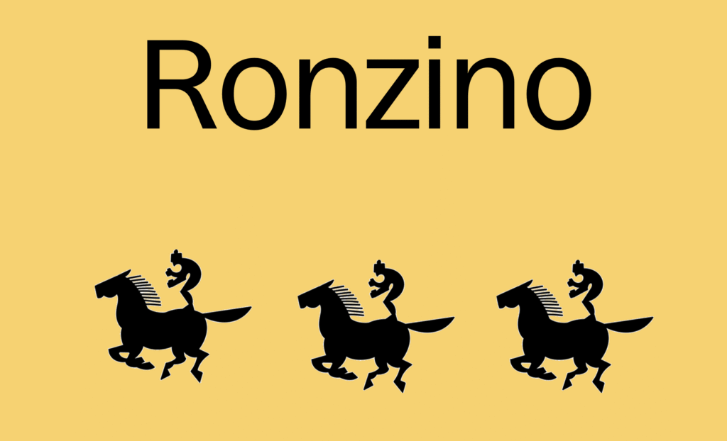
1. Ronzino – Confidence in Sans Serif Form
Download Here: https://www.collletttivo.it/typefaces/ronzino
Ronzino isn’t just another sans serif. It’s got presence. It’s confident. It’s a little brutal, but still elegant when it has space to breathe. If you’re working on something fashion-forward, editorial, or packaging where the type is the design, this one’s a winner.
Design Note:
Don’t clutter around Ronzino. Give it space. Let it lead. Pair it with soft neutrals and subtle textures, and it’ll feel bold but elevated. Think title spreads—not captions.
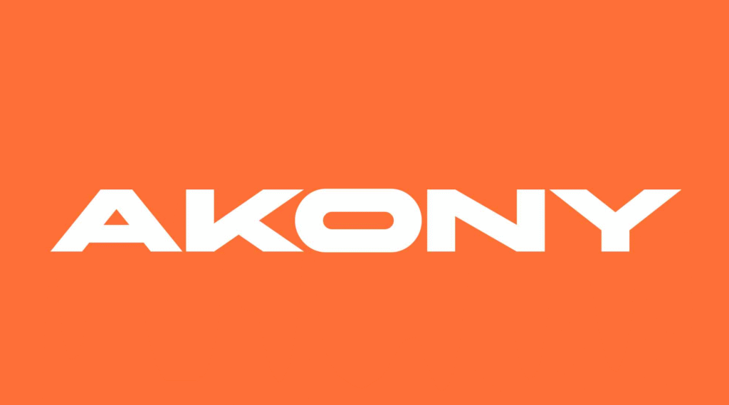
2. Akony – Loud, Wide, Unapologetic
Download here: https://unblast.com/akony-display-font/
Akony doesn’t whisper. It demands attention. With wide letterforms, sharp cuts, and a blocky attitude, this display font was born to dominate.
Where it thrives: brutalist layouts, music branding, streetwear, cinemagraphic posters. It’s not decorative—it’s directive.
Pro Tip:
Use it at scale. Full width, hero sections, merch drops. It is the design. Keep everything else minimal and let Aonei do the heavy lifting.
3. SK Modernist – Clean Geometry, Zero Noise
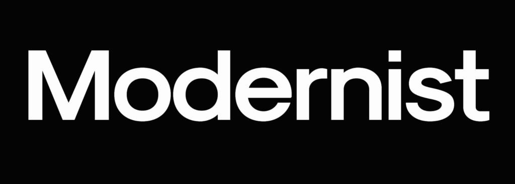
SK Modernist is for those who get the power of subtlety. It’s geometric, structured, and clean—but never sterile. It works in UI headers, case studies, digital brands—basically anywhere you want clean hierarchy without shouting.
Why it works:
Because it doesn’t try too hard. It balances beautifully with other elements, scales like a pro, and brings clarity wherever it lands.
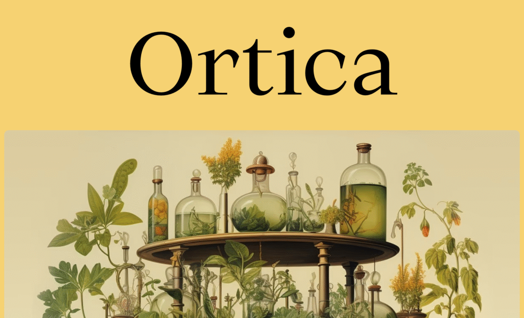
4. Ortica – Serif With a Modern Soul
Download Here: https://www.collletttivo.it/typefaces/orticahttps://www.collletttivo.it/typefaces/ortica
Unlike most trendy display fonts, Ortica brings something different—it’s a serif with style. Not old-school, not overly ornate. Just that perfect blend of classic proportions and modern angles.
It comes in multiple weights and styles—so you can go full-on bold or ultra-refined. Use it on fashion branding, magazine spreads, or anywhere you need elegance with edge.
Creative Hack:
Tight tracking. Oversized leading. Big titles or refined quotes. It flexes depending on how you use it—and that’s the real power.
5. Project Blackbird – Bold. Compressed. Industrial.
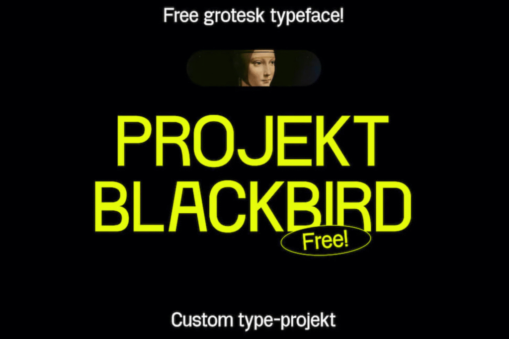
Download Here: https://pixelsurplus.com/collections/free-fonts/products/projekt-blackbird-free-sans-serif-font
Project Blackbird is loud in the best possible way. It’s a little chunky, a little uneven, and that’s what makes it feel real. It stands out in a sea of clean perfection.
Perfect for music posters, bold merch, or gritty editorial layouts. This is the kind of font that turns heads and breaks the grid (in a good way).
Keep it balanced:
Use it as the lead. Pair it with clean, lightweight elements to keep your layout from tipping into chaos.
6. Gyst – Clarity Without the Noise
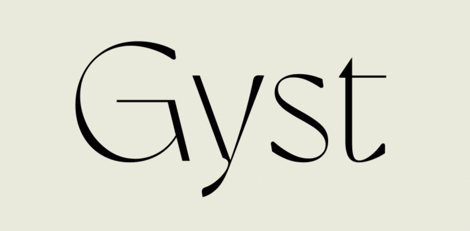
Download Here:https://fonts.adobe.com/fonts/gyst-variable
Gyst, from Versal, was made for UI—but that doesn’t mean it’s only for screens. This font is all about clarity with character. It’s neutral but not boring, and that’s rare.
Use it for digital brands, case studies, clean product specs—anything that needs structure and consistency across formats.
Quick Tip:
Don’t force it into flashy settings. Let the layout and spacing do the talking. Guist will keep everything grounded.
7. Geist – Flexibility That Feels Custom

Download Here: https://fonts.google.com/specimen/Geist
Last but definitely not least—Geist. A variable font that gives you full control over weight and width. Go extended. Go condensed. Go bold or go light. This font adapts.
If you’re building a branding system in 2025, this is gold. One font family, multiple voices. That’s cohesion without repetition.
Extra win:
It’s part of the Adobe Fonts library, so it’s already free if you’re subscribed. Use it across logos, UI, social—whatever. It scales like a dream.
Final Thoughts: Direct Your Fonts Like a Designer
Here’s the truth: the best fonts in the world won’t save a bad layout. Premium design doesn’t come from picking beautiful typefaces. It comes from using them well.
So before you drop any of these into your next project, ask yourself:
- Is this font the lead or the support?
- Am I creating hierarchy, or just styling?
- Am I using space intentionally?
Great designers don’t just pick fonts—they direct them. These Best Free Fonts of 2025? They’ve got the range. Now it’s on you to give them the stage.